
RAL Colour Feeling 2028+
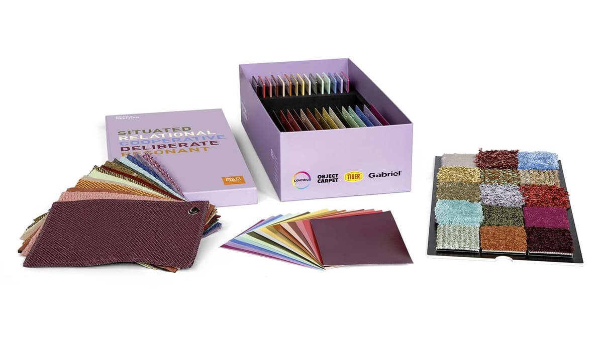
Under the motto READ + RESPOND, the new trend report presents 15 colours that answer to their place: global colour tendencies, applied to context. The accompanying RAL Trendbox 2028+ translates the palette into 75 material samples.
The 15 trend colours
Colour rendering on screen is indicative — only physical RAL samples are binding.
Application and inspiration
RAL describes Colour Feeling 2028+ as a mediator between colour and place: between global colour tendencies and design that answers to its context. That asks you to read first and respond second — hence the motto READ + RESPOND. Each colour was chosen for its effect in space, its behaviour on material and its cultural meaning.
The palette is built in three layers. The quiet base tones — pepper white, transparent mauve and golden quartz ochre — form the foundation. The accents, such as kiwi sorbet green, straw yellow and soft orange, bring light and movement. The characterful tones butterfly blue, maple red, madder rose and broccoli green set the identity of a product, interior or façade. Five colours carry over from the previous edition — pinkish brown, antique pink, pepper white, light teal and kiwi sorbet green — so that an existing palette does not age all at once.
Because all fifteen are tuned to one another, they combine into harmony as readily as into contrast. And because they come from the RAL Design System plus, a palette can always be extended with the 1,825 colours of that system — keeping the same codes for production and communication.
Colour never stands alone. Material, finish, incident light and context all play their part. The RAL Trendbox 2028+ therefore translates the palette into 75 samples of five kinds: RAL D6 colour sheets, plastic, metal, carpet and textile — so that you can feel the choice rather than only see it.
How to get the most out of it
- Work the colours into mood boards and material studies, preferably together with the Trendbox.
- Test the colour in the context of your own project: light, finish, service life and brand identity all shape the result.
- Weigh more than aesthetics — comfort in use, brand experience, durability and circularity all belong in the choice.
How to order the palette
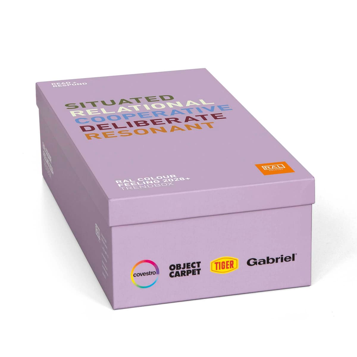
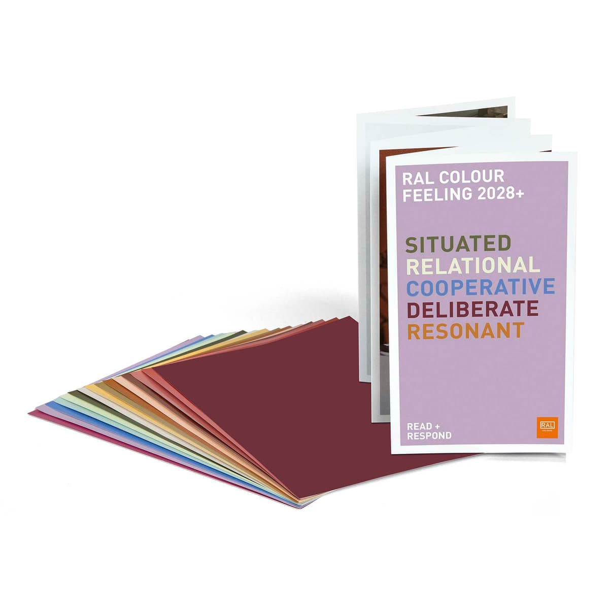
The trend colours come as colour sheets and as a material box. All three include the leporello with the trend report.
.jpg&w=1200&q=75)
Earlier editions
RAL Colour Feeling appears in editions that build on one another: each edition carries colours over from the last. Colours from earlier editions remain available — they are RAL Design colours.
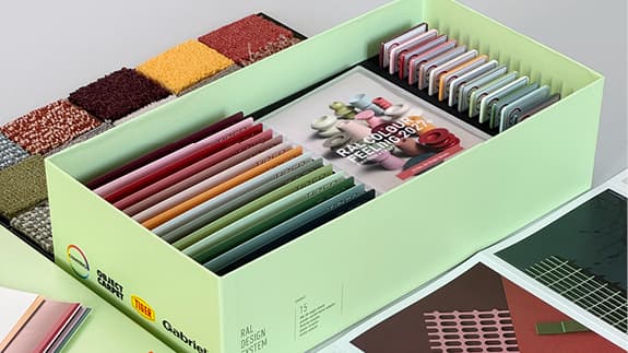 2027+ENVISION + CRAFTForward-looking concepts joined to the precision of the crafts; fifteen colours for hybrid spaces and circular materials.View this edition →
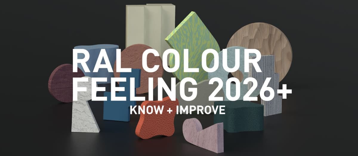 2026+KNOW + IMPROVEFifteen colours connecting past and present: five shades from the previous edition, joined by ten new ones.View this edition →
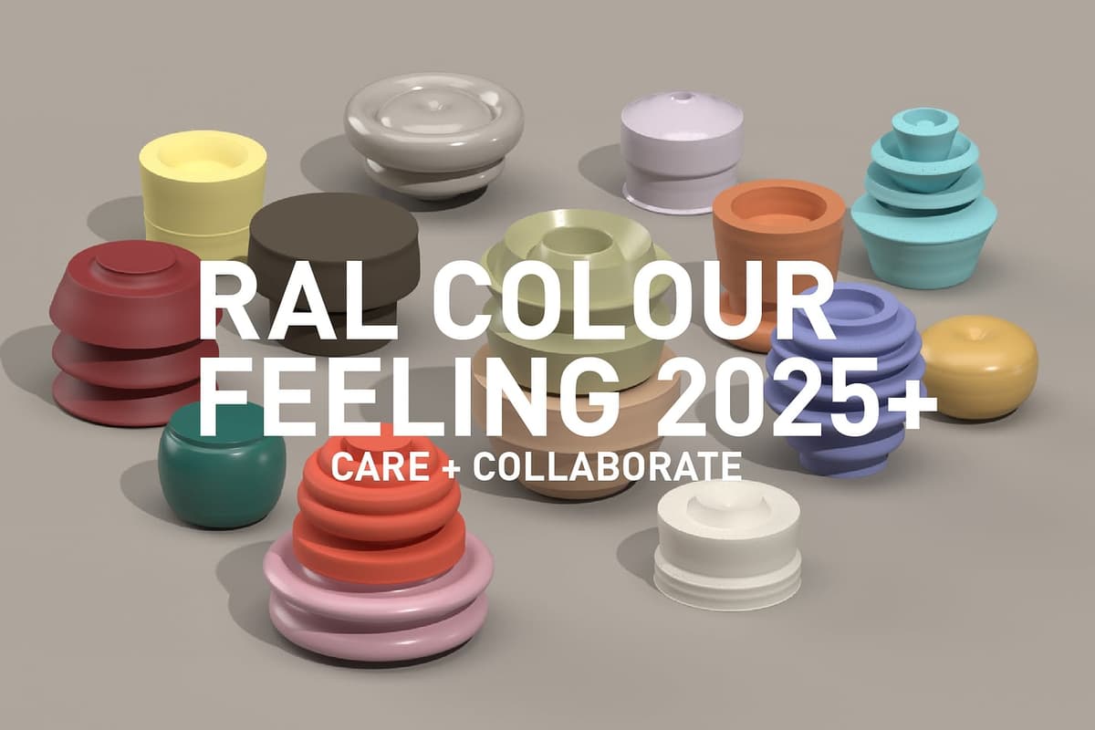 2025+CARE + COLLABORATEThe first edition with a collection of materials alongside the palette — colour judged together with textile, metal and wood.View this edition →2023+SHARE + APPLYNatural and digital shades for hybrid design, between nature-inspired colours and the rise of the metaverse.View this edition →