
Archive · trend report

RAL Colour Feeling 2026+

KNOW + IMPROVE · Know and improve

RAL Colour Feeling 2026+ supports the functional and atmospheric design of physical and virtual products, collections and spaces alike. The fifteen nuanced colours are meant as an aid to decisions in design, architecture, industry, the trades and commerce.
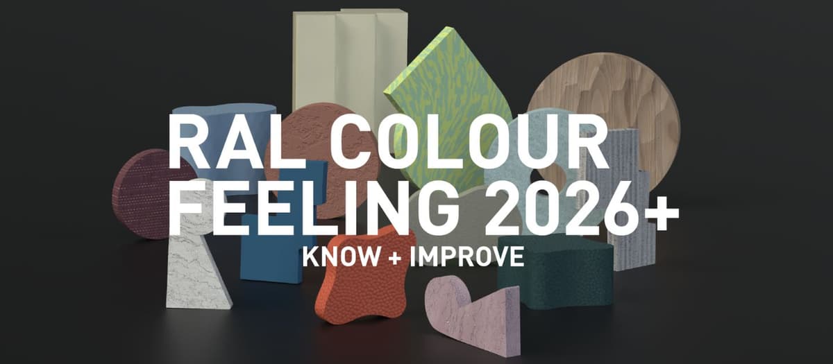
RAL Colour Feeling 2026+

The 15 trend colours

Colour rendering on screen is indicative — only physical RAL samples are binding.

RAL 095 90 20Pearl yellowPearl yellow radiates a soft mood of optimism. It is a good alternative to bright white, but needs good lighting to come into its own. This pastel shade harmonises with a great many colours, across widely differing design categories.View & order →RAL 180 80 10Light tealLight teal gives a fresh feeling without coming across as cold. Calm and serene, it recalls a sunlit sky and is particularly suited to ceilings. Subtle and yet full of character — a counterweight to warmer palettes and natural materials.View & order →RAL 230 40 25Workshop blueWorkshop blue is as practical as its name promises. From ultra-matt to high gloss, this colour has proved itself in many applications. Strong for accents and zoning, but finishing a whole room in it works just as well.View & order →RAL 060 70 20Peanut creamPeanut cream gives a warm, relaxed, nature-inspired feeling. It combines with many colours in most surroundings. More neutral than terracotta and softer than beiges and greys.View & order →RAL 040 50 60Fox redFox red is a striking accent colour that makes a lively statement. Energetic and optimistic, perfect for emphasising details and points of interest. A small amount is usually enough to draw the eye.View & order →RAL 090 85 05Pepper whitePepper white creates a soft atmosphere. Balanced and versatile, usable in any quantity and suited to most lighting conditions. Easier on the eye and easier to combine than pure white.View & order →RAL 240 60 15Architecture blueArchitecture blue has a stabilising effect. Unlike many blues, it does not visually recede. Restrained and calm, easy to combine and usable at any scale — a safe choice for anyone who wants more colour.View & order →RAL 110 85 50Sprout greenSprout green is motivating and energetic. This lively accent colour works best in moderation and adds freshness to physical and digital colour palettes alike.View & order →RAL 190 20 20Night turquoiseNight turquoise has a fascinating depth. It combines with every material and surface, at any scale. Think of it as a more restrained alternative to black; ideal as a background colour for walls and ceilings.View & order →RAL 080 70 05Garlic beigeGarlic beige calms whatever looks too hectic in its surroundings. A safe choice for the base — though do combine it with a few accents to avoid monotony.View & order →RAL 100 60 10Olivine greyOlivine grey is a flexible, unpretentious all-rounder for everything from architecture to fashion. It harmonises with many other colours, works as a calming background and conceals unevenness.View & order →RAL 140 80 30Relaxing greenRelaxing green revitalises accents and zoning. Material and finish make a great deal of difference: matt and textured strengthens the calming effect, while a higher gloss level brings out the refreshing one.View & order →RAL 010 30 20Pinkish brownPinkish brown carries a hint of refinement. Deep and versatile, it is as much at home in graphic design as in architecture, from historically inspired to emphatically contemporary.View & order →RAL 360 70 15Opaline pinkOpaline pink creates a welcoming, memorable atmosphere. Strong at defining spaces and adding detail — and, contrary to what is often assumed, it works beautifully on floors and walls.View & order →RAL 040 50 30Rust colourView & order →

Application and background

The 2026+ palette bridges past and present while looking ahead to the future. Five colours from the previous edition — peanut cream, fox red, pepper white, garlic beige and opaline pink — are joined by ten new companions from the RAL Design System plus. Three colours have been influential since 2023+ and remain modern classics.

That continuity is a deliberate choice: it saves resources, simplifies combining, and lengthens the life of a palette. It creates room for genuine improvement rather than annual replacement.

Context-sensitive, inclusive design contributes significantly to wellbeing and remains an essential part of successful work. The palette meets complex demands by balancing warm and cool shades, restrained and striking nuances, and forward-looking and historically inspired tones. Stronger contrasts also take account of the needs of people with limited sight and colour blindness.

Use the RAL Design System plus to refine and optimise the fifteen colours for your own projects. You can also combine them with colours from earlier Colour Feeling editions.

Applying them functionally and atmospherically

All the shades combine flexibly with one another. The colour profiles support decisions for high-quality working and living spaces, and specifically support functionality, sensuality, recovery, communication and creativity.

The recommendations rest on scientific trend research, economic and ecological considerations, sound colour psychology and years of experience in demanding colour design.

Our colour inspirations make it easier to design professional and private surroundings, products and collections harmoniously for widely differing individuals and groups. They encourage constructive exchange, help reduce anxiety and support wellbeing.

Colour, material and finish

Colours come across more subtly on matt, textured surfaces. Higher gloss levels often make them look more intense, and transparency can produce surprising effects. So the question is not only which colour, but which combination of colour, material and finish.

As a companion to RAL Colour Feeling 2026+, the RAL Trendbox 2026+ appeared, translating the fifteen trend colours onto five different materials and surfaces. Use the samples for mood boards and concept visualisations.

The RAL Trendbox 2026+ was made in collaboration with Covestro, Gabriel, Object Carpet, Tiger Coatings and the German Design Council.