
RAL Colour Feeling 2027+
RAL Colour Feeling 2027+ joins forward-looking concepts to the precision of the crafts. Its fifteen colours answer the design questions of hybrid spaces, adaptive forms and circular materials.
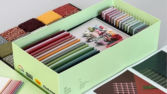
The 15 trend colours
Colour rendering on screen is indicative — only physical RAL samples are binding.
Application and background
The fifteen colours of RAL Colour Feeling 2027+ answer the design questions of that year: hybrid spaces, adaptive forms, circular materials and the interweaving of the physical and the digital. Each colour was chosen for its effect in a space, its behaviour on a material and its cultural meaning.
The palette is built in three layers. The neutral base tones — pepper white, pale sienna and olivine grey — form the foundation. The accent colours, such as marzipan pink, topaz yellow, kiwi sorbet green and spicy red, bring movement. The characterful tones pinkish brown, corundum blue and Spanish green set the identity of a product, an interior or a facade.
Because all fifteen are tuned to one another, they combine into harmony and into contrast alike. And because they come from the RAL Design System plus, a palette can always be extended with the 1,825 colours of that system — keeping the same codes for production and for communication.
Colour, material and finish
Colour never stands alone. Material, finish, the fall of light and context all play their part. The RAL Trendbox 2027+ therefore translated the palette into colour sheets, textile, metal and plastic, so that the choice could be felt rather than merely seen.